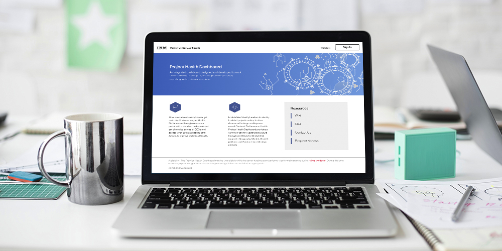
Project Health Dashboard
The Problem
IBM Global Business Services includes strategy consulting. Due to the fact that IBM GBS deals with many clients with various projects, it’s important to keep track of performance and progress. IBM GBS needs an all-encompassing platform to gather this sort of information. It’s important to have such a tool in order to keep track of how well they are doing as a company, see how efficient their employees are, identify if any projects are in need of any actions to improve business results.
The Solution
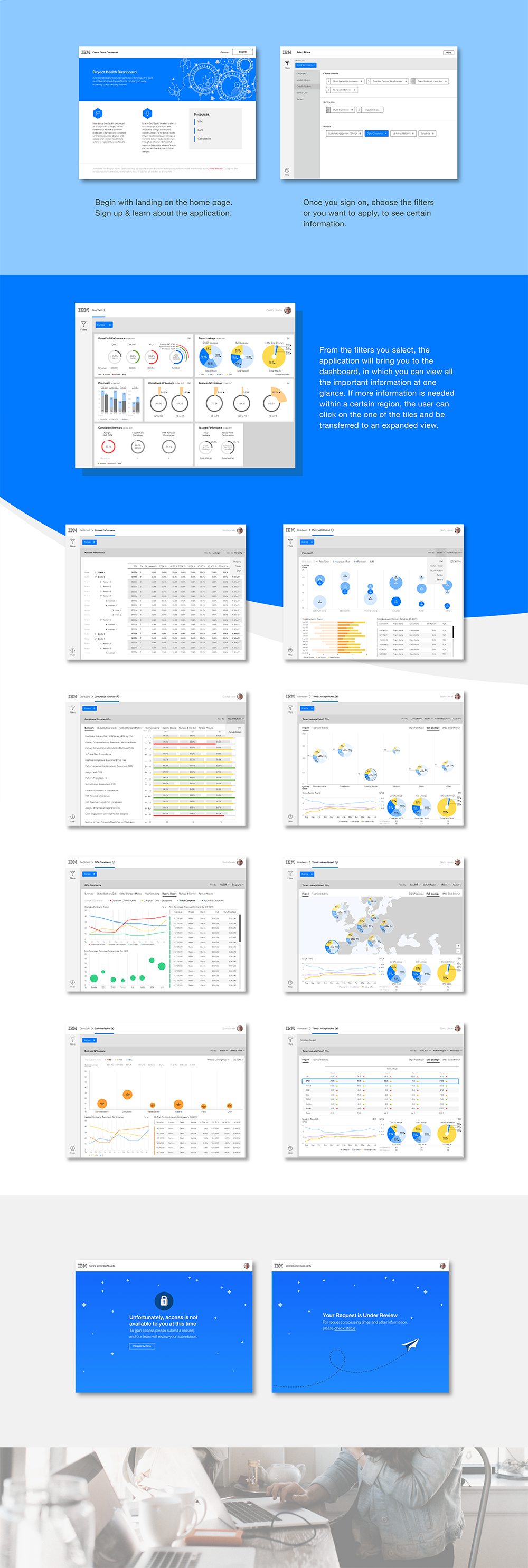
Working alongside with Business analysts, a team of designers aided in creating an all-inclusive dashboard for reporting key delivery metrics. It provides the analysis for Geography, Market, Growth Platform, and Service Line. We needed to create a platform that would not only deliver these metrics but also display it in an easy to understand manner. The entire platform is sprinkled with engaging data charts that make the information easier and faster to comprehend. We strategically used certain data charts and color for certain information. Color, especially, played an important role in our designs. We use certain colors to convey a certain types of quick emotional response. Reds were used to signal attention, while green was used to signal that everything is in check or good.
My Role
UI/UX Designer, Visual Designer
Tools
Sketch (Wireframes and Visual Design), Invision (Prototyping)
Inspiration/ Research
I used Google Analytics, JIRA, and Shopify as inspiration for designing a dashboard.
I used Joe Hallock’s study on color as a reference point to understand what types of colors to use within the application.
Persona
The users of the new app would be IBM partners, managers, and other project leads. Since they look after numerous projects they are in need of a platform that could simplify their job. In doing so they will be able to identify troubled projects earlier and improve overall project performance.
Meet Marija, she’s a project manager at IBM. As a project manager she needs to be vigilant and constantly needs to be aware of how the project is coming about. She needs to be able to keep track of all her employees and identify as quickly as possible if there’s any problems.
Storyboarding
Keeping Marija in mind, the Business analysts were able to list out the features they felt would make her job easier and more efficient. We created a To-Be Journey Map of her day to day work experience and then were able to pinpoint the main features to include within the app.
Sitemap
After narrowing down the essential features, we created a sitemap to organize the navigation of the experience.
Wireframes / Mockups
Wireframes were then created. After several iterations based on the user’s needs and user testing, we were able to come with these mockups.
User Acceptance Testing
We used high fidelity wireframes to test out with potential users. IBM managers, project leads, and business analysts tested out the application. They appreciated how we were able to simplify the information. They enjoyed interacting with the data visualizations. Some visualizations, were unfortunately difficult to understand, and therefore had to be looked at again.
What We Learned
We had difficulties developing the wireframes to the actual product. It was hard to mimic and translate the unique visual elements within the design. The developers and the designers needed to be in constant contact in order to achieve the best intended product.
Some of the data visualizations were difficult to understand, and although understanding the data visualization information seemed second nature to the team; to the untrained eye it was a task –and having it be a task seemed counterintuitive, since we were trying to make it easier for them.
Although some visualizations were hard to understand, some really helped the users.


